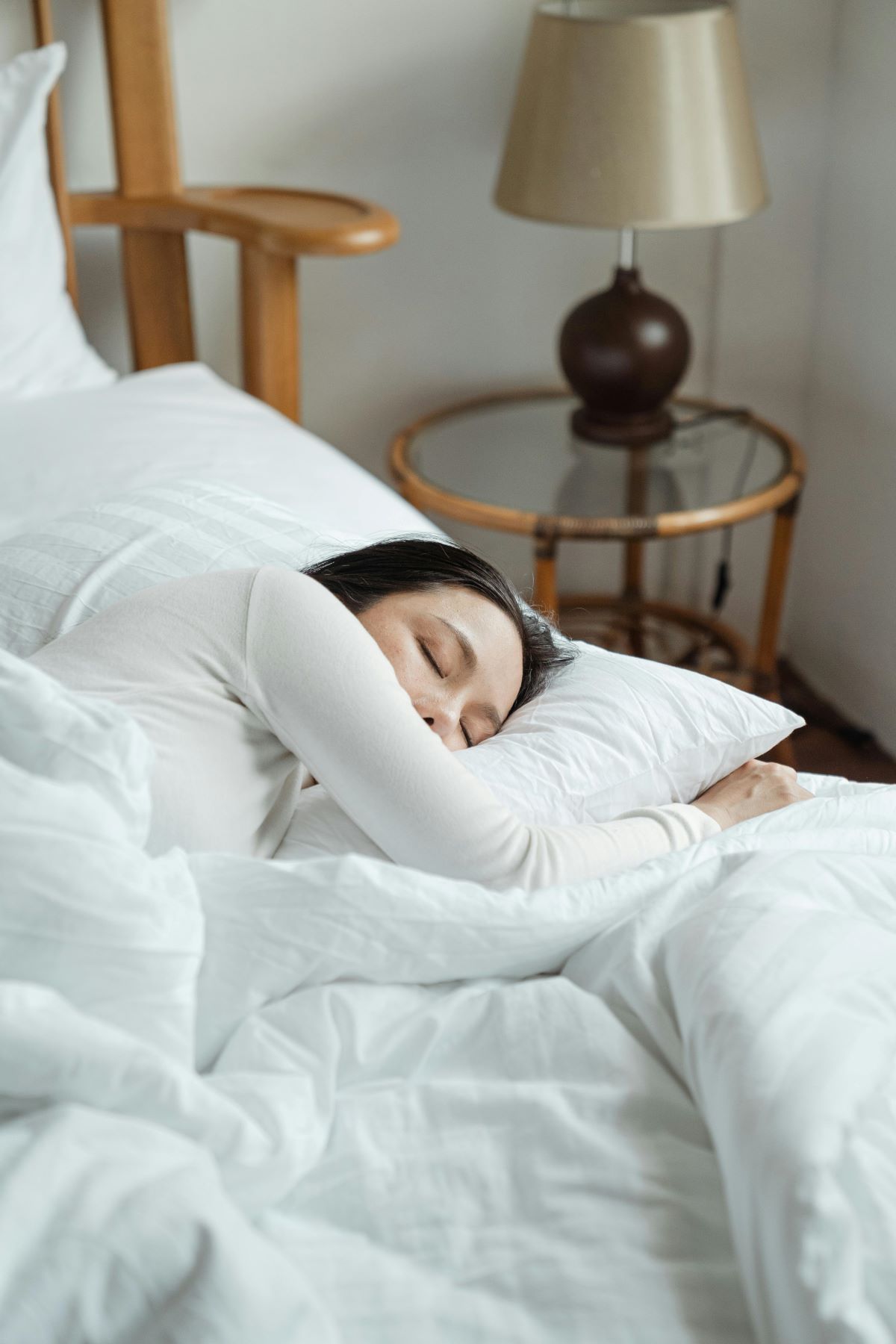
Our bedrooms are the most important part of our house, so it's vital to use the right Colors For a Good Night's Sleep. It’s where we rest, recuperate and get the quality sleep our brain and body needs to be at its optimum the following day.
Best and Worst Colors For a Good Night's Sleep
A lack of sleep can have such a huge impact on our lives, with poor quality sleep being a contributing factor in a wealth of mental health conditions, from depression and anxiety to even addiction, with UK Rehab, an alcohol rehab UK based often highlighting the lack of routine and good quality sleep exacerbating alcoholism in those that struggle with it.
But that’s across the board. After all, most of us get a bit grumpy after a bad night’s sleep.
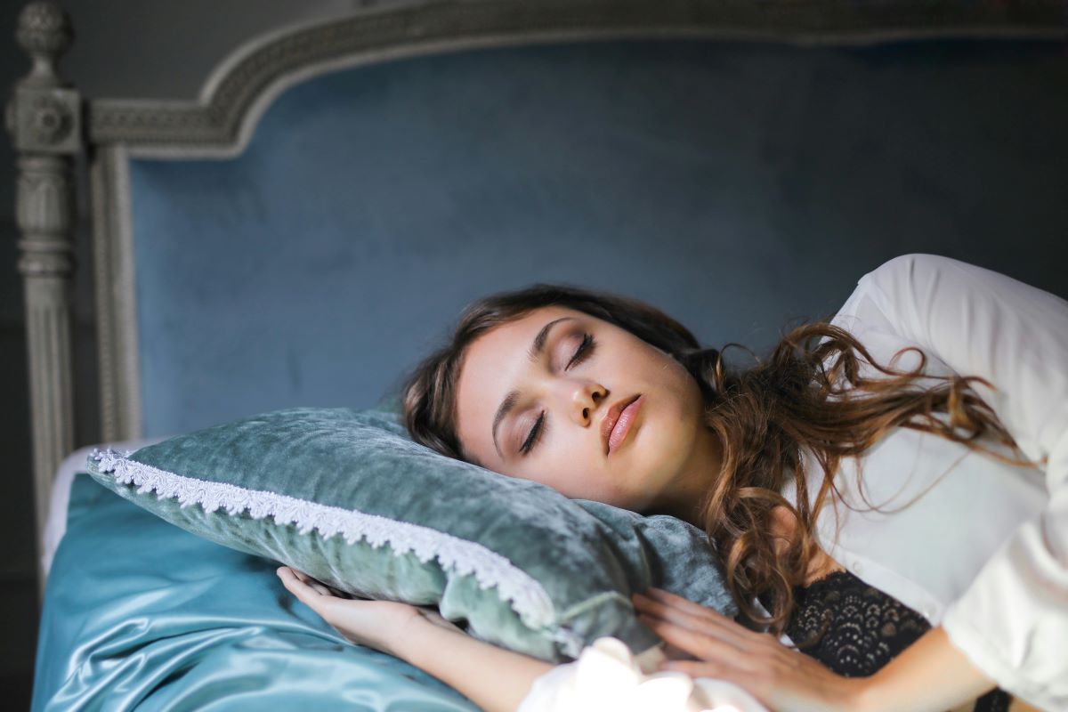
To get a good night’s sleep, you of course need a comfortable bed, but there are also several other factors to consider, including the colour scheme and atmosphere of our bedroom.
Yes, colour can play a huge part in our sleeping patterns and some colour decoration is much more effective than others. So, if you’re currently thinking about redecorating your bedroom, here are the best and worst colours to consider and avoid…

Best Colors for Sleep
Soft Blues
Soft blues and shades like light azure or pale cerulean are well known for their calming qualities. Blue has been shown to help reduce blood pressure and heart rate, making it a perfect colour for relaxing environments, with it effectively mimicking the soothing tones of the sea and the sky.
Subtle Greens
Greens help people connect with nature and feel a sense of renewal. Colours like olive, sage and other soft greens evoke a sense of balance and harmony, reducing anxiety and creating a peaceful environment that’s certainly conducive to sleep.
Soothing Lavenders
We all know that lavender scents can be calming, but it’s the same with the colour too. Purple tones have a calming impact on the mind and can encourage relaxation. It’s a popular colour for bedrooms, and combined with candles or diffusers, can create an incredibly serene environment for sleeping.
Warm Neutrals
Colours like beige, taupe and light grey can create a cosy and inviting environment in the bedroom. The neutral backdrop they provide promotes relaxation without overwhelming the senses. What’s more, they can be easily combined with other calming colour tones to create a pleasant environment for you to drift off in.
Worst Colours for Sleep
Bright Reds
It perhaps comes as no surprise that bright reds aren’t exactly the best for sleeping. They are more stimulating and energising colours, which don’t exactly allow you to wind down. In fact, the colour red has been associated with increasing the heart rate and alertness, the complete opposite of what you want when you’re trying to sleep.
Bold Yellows
Similarly, bright yellows and oranges are more associated with energy and excitement, which are better avoided in the bedroom. Such colours are much better placed in the kitchen or in home gyms or offices where productivity is among the core goals of the room.
Electric Blues
While some blues will relax you, brighter and more electric shades can have the opposite effect. Brighter blues can be too stimulating and the body may struggle to unwind and prepare for sleep as a result.
Loud Neons
Of course, finally, neon colors are not going to help you get to sleep. Neon greens, pinks, yellows or any other colors are disruptive, intense and overstimulating. If you want any sleep, avoid these colors!


Leave a Reply